Design Advice
This page has a selection of badge designs to help you create a well designed badge around your company logo or branding. Several rules of thumb will be demonstrated, together with examples and screenshots to help you make the right decision.
1) Choosing the best size badge for you
With our Prestige range of name badges, you have a choice of sizes and sometimes it's hard to decide exactly which size to go for. Often, this decision should be largely focused around the shape of your logo.
Wide logos
If your company logo is a wide logo, it is often a good idea to choose a relatively deep badge (perhaps 30mm or 35mm tall) and place the logo across the top of the badge.
![]()
The above example shows a wide company logo placed across the top of a Prestige 74x30mm badge with an example name and job title beneath. This is a good way to design a badge, with everything centre aligned and adequate and even spacing around the outside of all text and the logo. The logo remains prominent and clearly readable, and the text below isn't squashed. Had a shorter badge been chosen, the text beneath the logo wouldn't have enough room and the badge could look crowded.
Square or thin logos
Conversely, if your company logo is square or portrait in orientation, it is often beneficial to choose a shorter badge (perhaps 20mm or 25mm tall) with your logo to the left or right hand side.
![]()
The above example shows a square company logo on the left hand side of a Prestige 74x25mm badge with an example name and job title to the right. This is the most common layout for logos of these proportions, with the logo large and clear and the name and job title of a reasonable size. If you don't need job titles, perhaps try having one line for Forename and another line beneath for Surname. This allows for a larger font, adding to the readability of the design.
No logo
If you're after a simple badge with perhaps just your name, the Prestige 64x15mm is often a good choice. We don't recommend having more than one line of text on the 64x15mm Prestige badge as this can be too small and leave the text unreadable.
2) Working with background colors and shapes
Once you have chosen the size of your badge and added your logo and a number of text lines, the next step is to choose your background colour. In many cases, a simple full colour background is the best choice, or alternatively our brushed gold and brushed silver options.
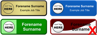
The designs above show a good example of how to use our brushed gold background option (top left), a good example of a full coloured background (top right), a good use of a multi-coloured split background (bottom left) and finally a poor use of a coloured swirl (marked with an X).
Problems with the above design
The coloured swirl shown on the design with the X above illustrates a common mistake and almost always produces a badge that is difficult to read. The shape chosen for this badge is a constant curve which presents several problems. Firstly, it makes aligning the text very difficult as there are no obvious limits to align to. Secondly it reduces the area available to place text without crossing over the colour divide. As a general rule, text shouldn't cross a colour divide and if your writing on a dark background you should always use light coloured text and visa-versa.
Logos and background colors
If your logo is saved as a JPEG you will often find that it has a white block around the outside. This is fine if you're going to place the logo onto a white, gold or silver background, as it will not be shown, but if you place it on a coloured background it will show.
![]()
![]()
As shown in the second of the two badges above, we always recommend placing logos with this white block onto a white, silver or gold background. If you have a different version of your logo (perhaps a PNG or GIF file) which has a transparent background it would look far better on the original background:
![]()
3) Text alignment
Choosing the alignment of the text is another decision that needs to be considered. As a general rule, if in doubt, centre align text where possible. Either to the entire width of the badge, or between the edge of a logo and the edge of the badge if a logo is included.
A bad example of text alignment is shown in the two images below. If you were to design the badge below with the text aligned to the left, it looks nice with a long name and job title as in the left example below, but when the shorter names and job titles are produced, a large amount of white space remains, leaving the badge looking uneven, as shown in the right example below.

To improve the situation, we would recommend centering the text across the entire badge. This helps to even out the white space, creating a more uniform design:

Name Badges International
(United States & Canada)
602 SW 12th Avenue,
Fort Lauderdale, FL 33021
Phone: 1-844-544-4994
Email: info@namebadgesinternational.ca